Brand Identity · MELA Foundation · 2024

A brand built from the inside out

MELA Foundation works at the edges of human life — the two decades where potential is most alive and most at risk. The identity needed to carry that weight without losing its warmth.

Client
MELA Foundation
Role
Creative Direction · Branding Strategy
Output
Identity System · Logo · Brand Language
Agency
Causate Collective
01 — The Mission

Two pivotal decades. Infinite possibility.

MELA Foundation is a philanthropic organisation focused on two windows in human life — ages 15 to 25, and 65 to 75. These are the decades where the gap between promise and reality is widest, and where the right support changes the entire trajectory of a life. The name itself is the mission.

M
Mental Health
Bridging the gap between inner life and outer support. Honouring struggle without diminishing dignity.
E
Environment
The world we inhabit shapes who we become. MELA works to make that world worthy of its people.
L
Learning
Not just education — the lifelong capacity to grow, adapt, and find meaning at every stage.
A
Ageing
Challenging the invisibility of later life. Redefining what it means to grow older with purpose and presence.
02 — Brand Perception

Twelve qualities that define the brand.

Brand perception isn't declared — it's accumulated. Every word MELA uses, every image it creates, every interaction it has builds toward a feeling. These twelve qualities are that feeling — the sum of how the foundation is meant to be experienced by everyone it touches.

Empathy Earthy Limitless Hand- made Celebration Support Social Lifespan Mind- driven Ageless People Purpose MELA
03 — The Three Pillars

What the brand does.

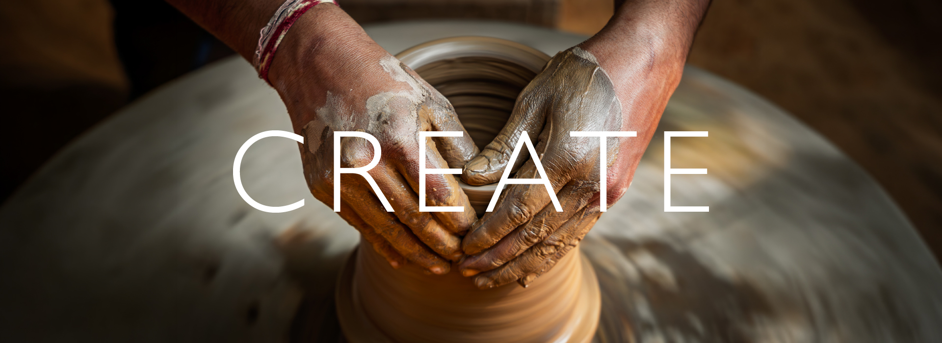
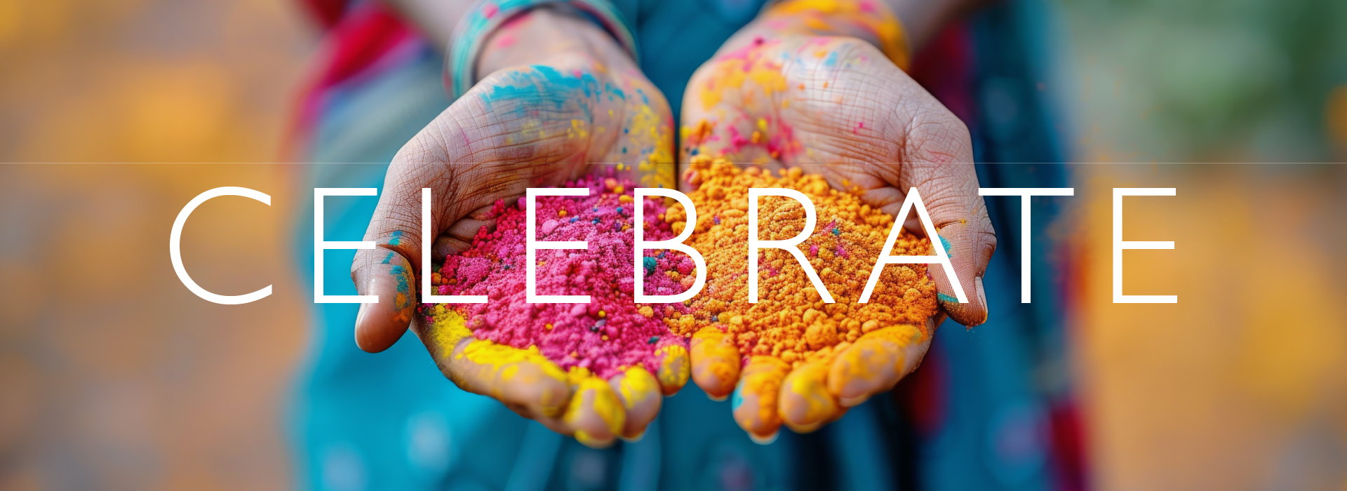
Every visual in the MELA world is organised around three action words — not descriptors, not values statements. Verbs. The brand doesn't tell you what it believes. It shows you what it does. And in every image, the hand is there — reaching, making, holding.

Pillar 01
Nurture
Care that doesn't overwhelm. The hand that steadies without gripping. Supporting mental health and environment through quiet, consistent presence.
Pillar 02
Create
Making things with your hands — ideas, communities, solutions. Creation as the antidote to helplessness. Learning through doing.
Pillar 03
Celebrate
Joy as a radical act. Honouring the young and the ageing as people who deserve to be seen, celebrated, and made to feel their life matters.
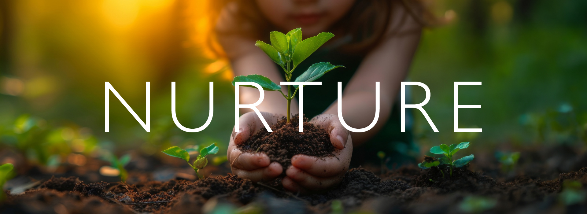
Nurture — Brand Visual
Create — Brand Visual
Celebrate — Brand Visual
04 — Brand Character

The feeling the brand carries.

MELA's personality isn't built on aspiration or corporate purpose-speak. It is rooted in the texture of real human life — earthy, warm, handmade, and quietly limitless. These aren't just adjectives. They're the lived experience the foundation is trying to create for the people it serves.

Tone
Earthy. Warm.
Hand-made. Never clinical, never cold. Always human.
Spirit
Purpose. Empathy. Celebration. Support. Social. Ageless.
Depth
Lifespan. Mind-driven. People-first. Limitless — always.
05 — Finding the Symbol

The hand was always the answer.

Across every visual direction explored for MELA — the photography, the pillars, the brand world — one thing kept returning. The human hand. It was not a decision made in a meeting. It arrived through the work itself.

The Gesture
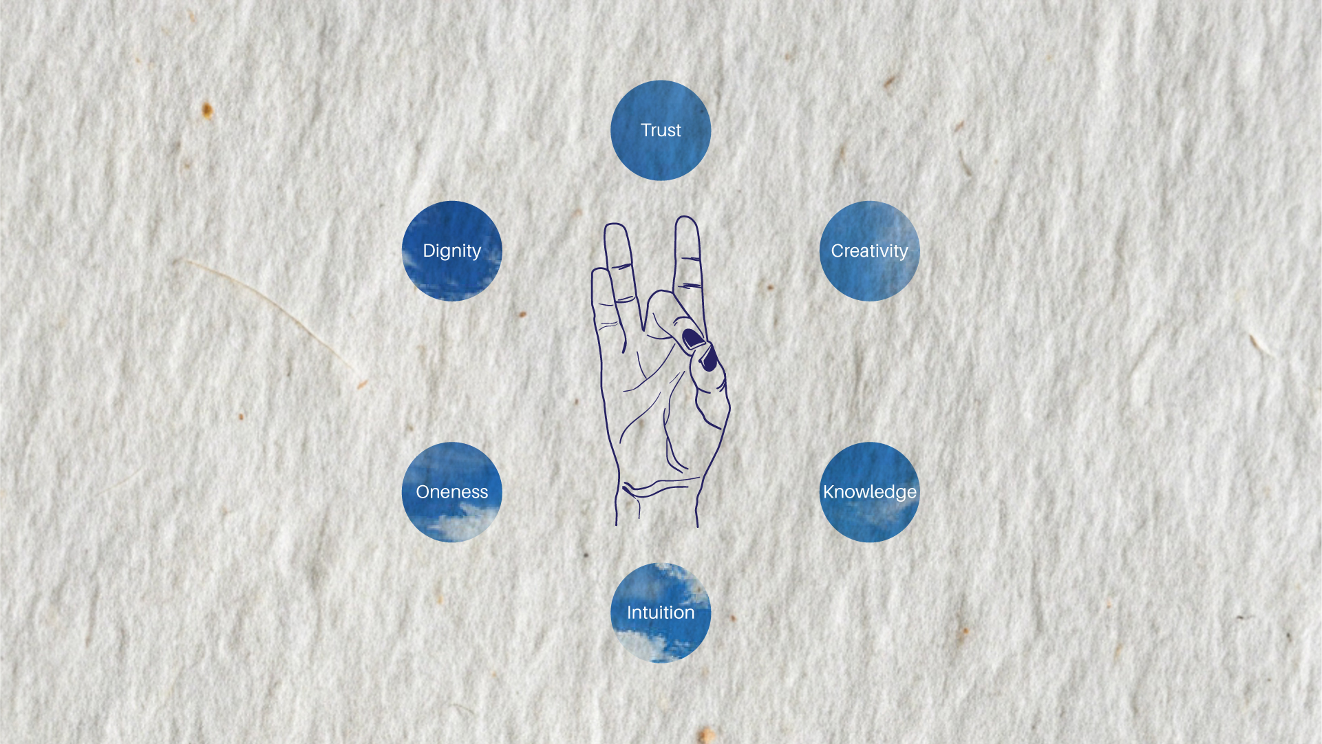
The Akasha Mudra is a gesture from Indian classical tradition in which the thumb and middle finger meet to form a circle, while the remaining fingers extend freely upward. Akasha means sky. Space. Ether. The element that holds all others and limits nothing.
Why This Mudra
Akasha is limitlessness. It is the quality of being open — to growth, to change, to possibility. Ancient, Indian, embodied, and deeply human. For an organisation working to expand what's possible for people at the edges of life, this wasn't a metaphor. It was a mission statement in a gesture.
Akasha Mudra — Line Illustration
06 — The Logo

The gesture becomes the name.

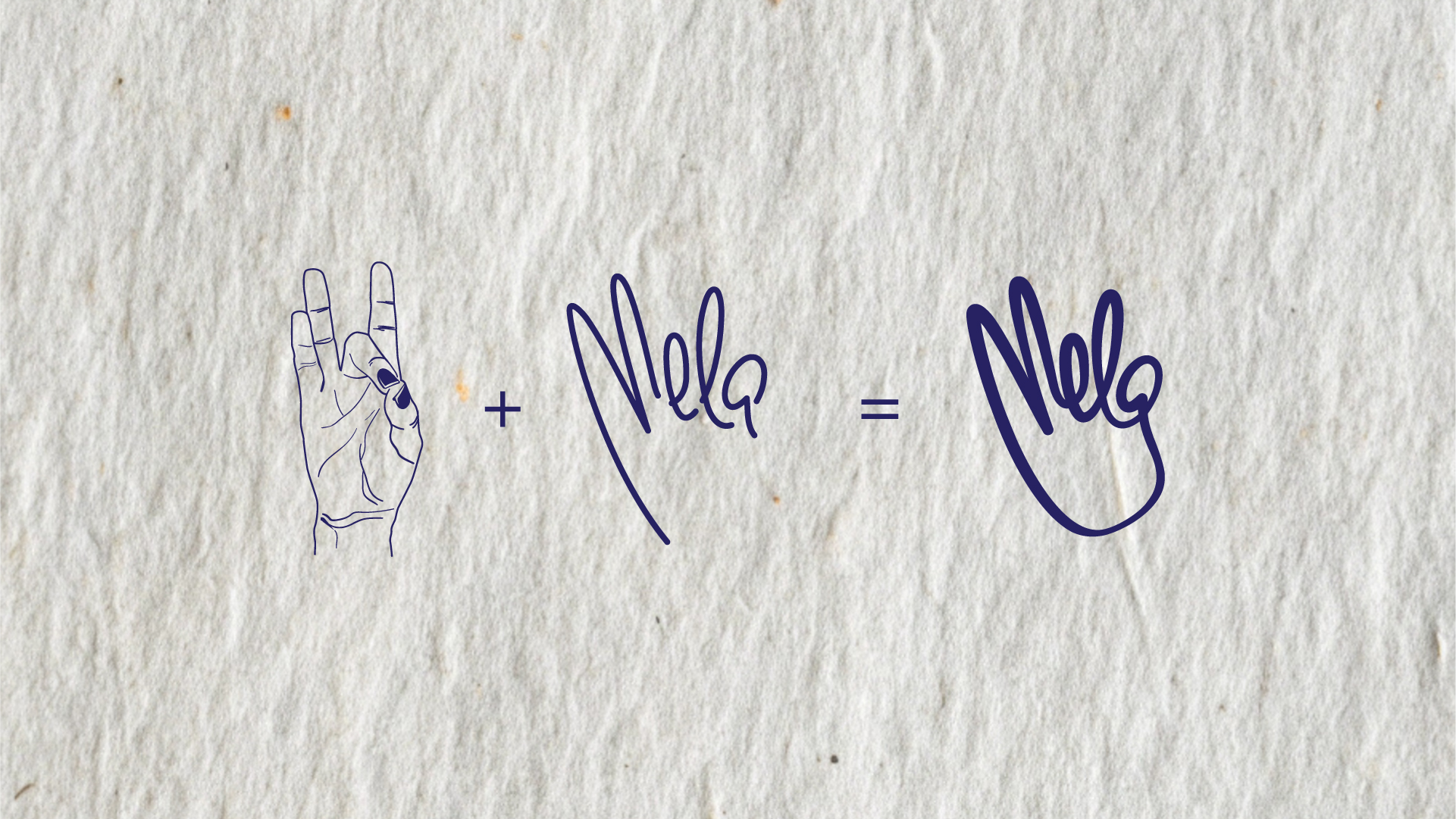
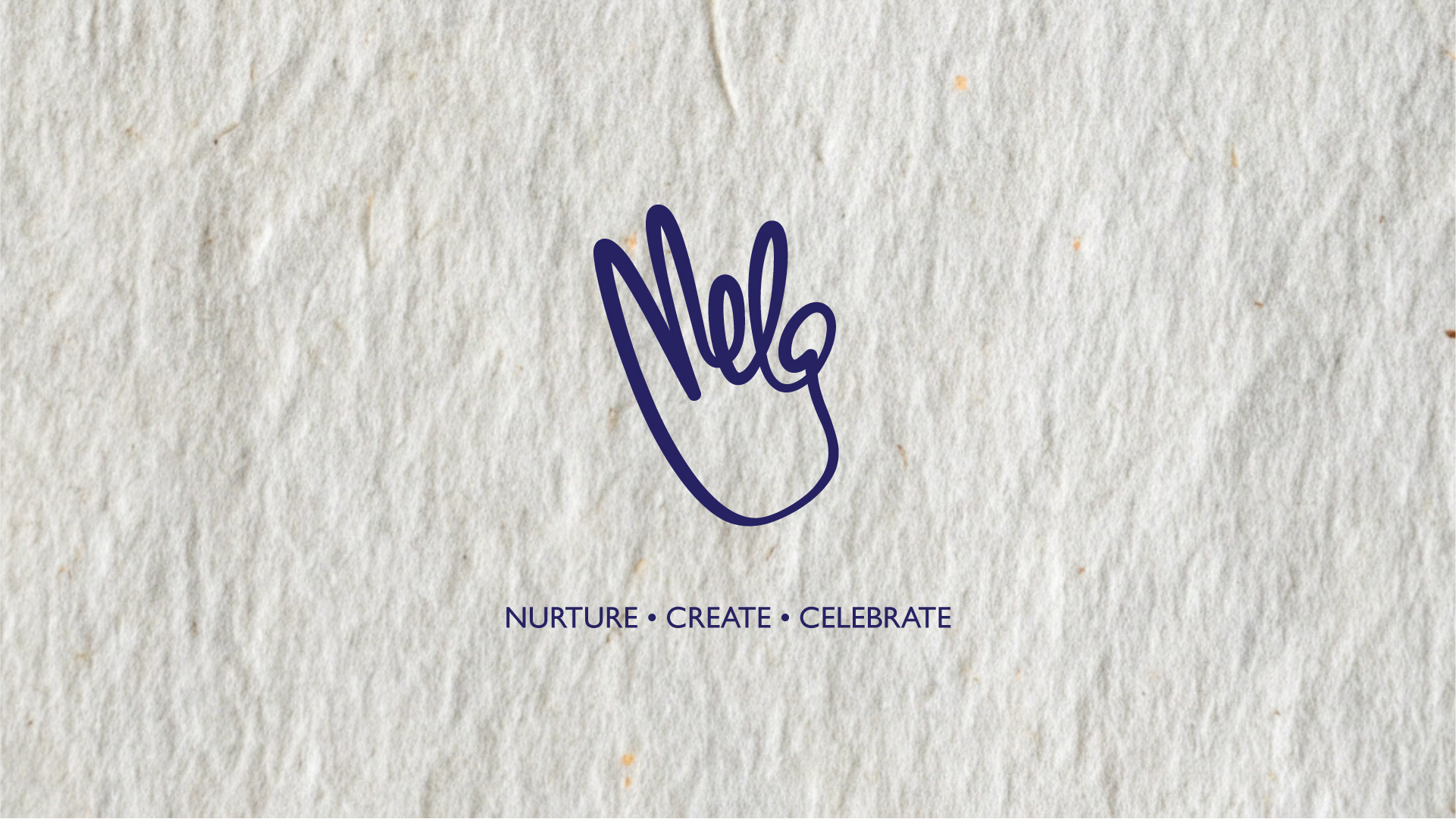
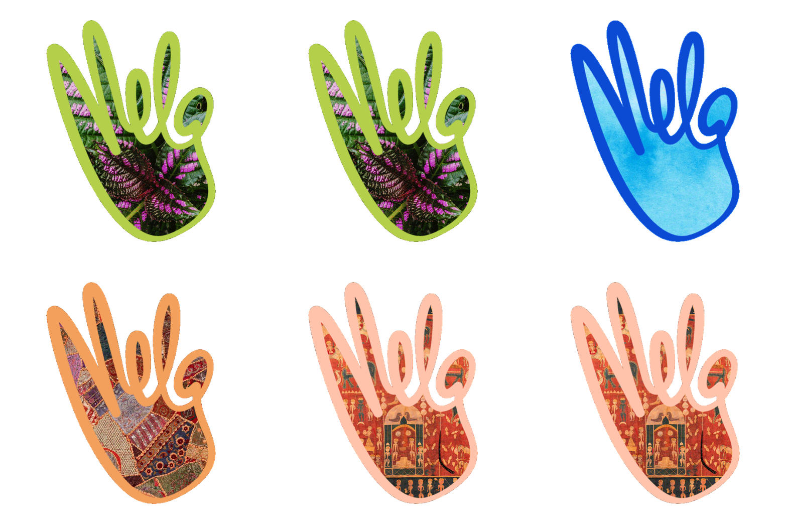
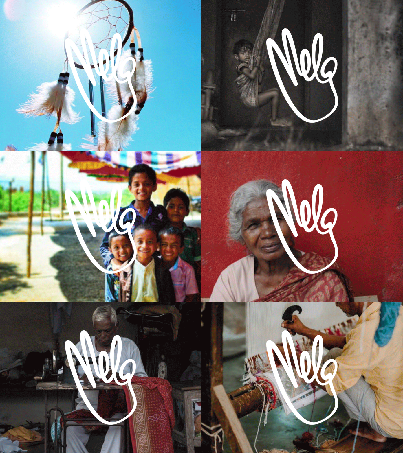
The MELA wordmark is not set in a typeface. It is drawn in the hand. The Akasha Mudra's fingers become the letterforms of M, E, L, A — in a single continuous gesture. The hand and the name are one thing. You cannot separate what MELA does from what MELA is.

The Derivation
Take the mudra illustration. Trace its fingers. The two free fingers rising upward become the strokes of M. The palm's line becomes E. The ring finger's arc carries L. And the circle formed by thumb meeting middle finger — Akasha itself, the space — becomes the enclosed loop of a. The word was always in the hand.
The Line
The wordmark is drawn with the same line weight and character as the mudra illustration. Same pen. Same hand. Same spirit. The logo doesn't look designed — it looks written. That distinction is the identity. A mark you feel before you read.
The equation
Logo Derivation — Mudra + Wordmark = MELA Mark
The mark
MELA — Final Logo Mark
MELA Logo Animation
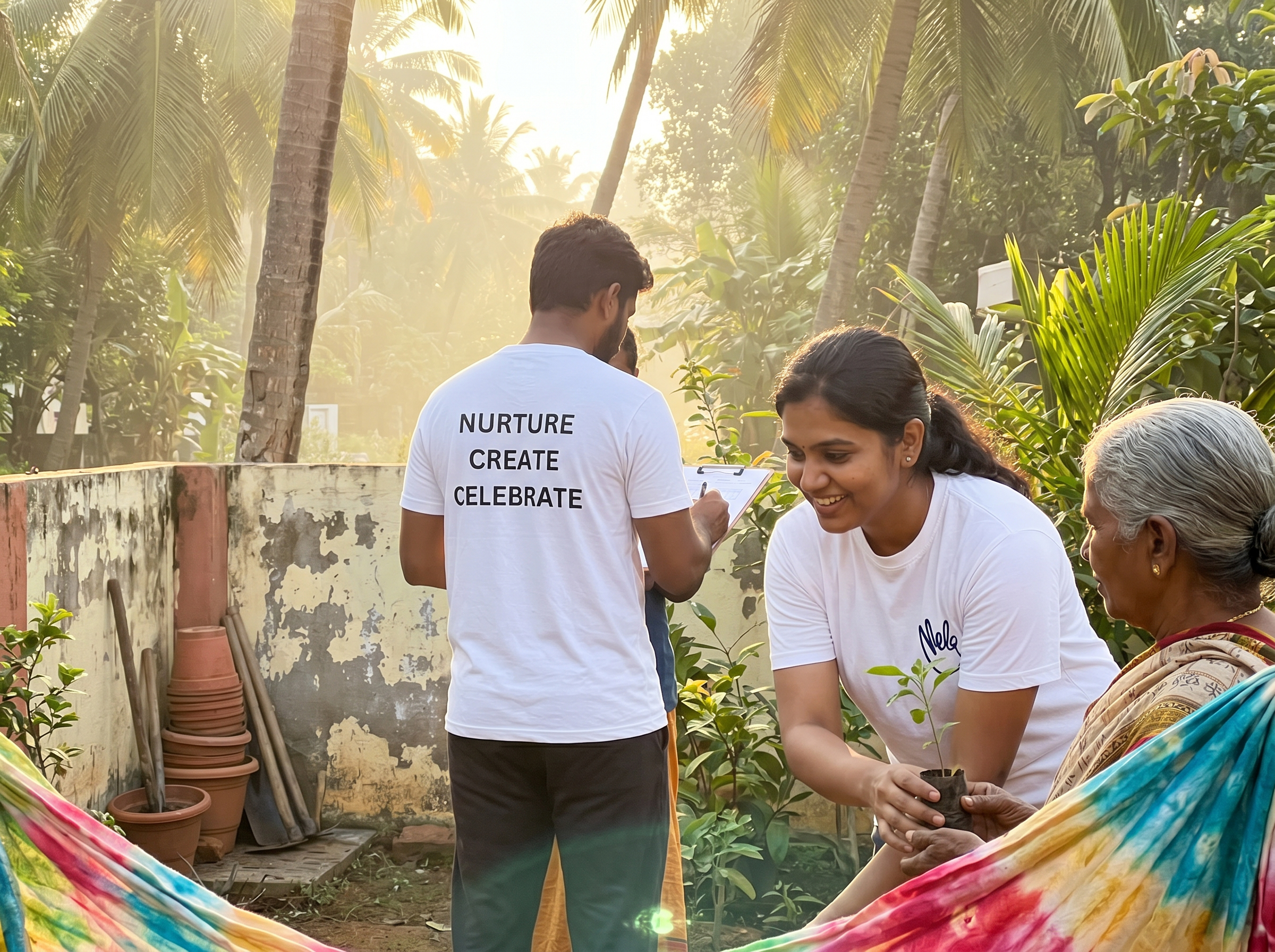
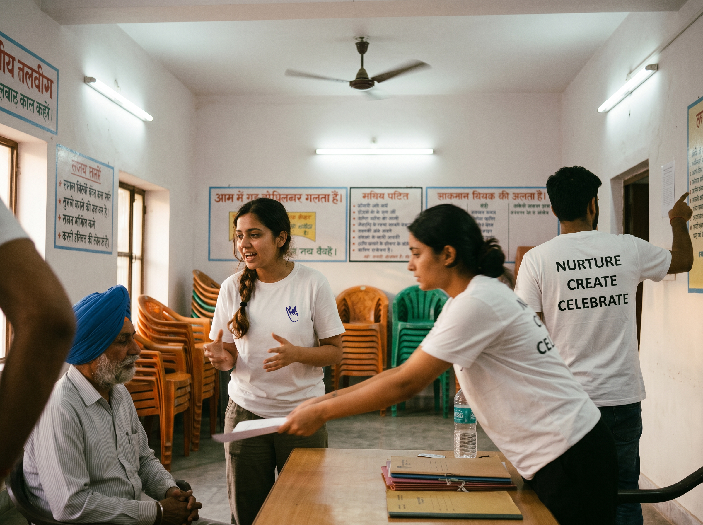
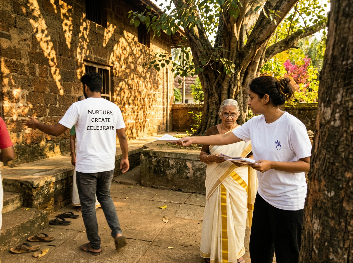
MELA Volunteers — Community Garden MELA Volunteers — Indoor Workshop MELA Volunteers — Outdoor Courtyard
MELA Brand Motion