B2B · Print · Wipro

Structure that earns attention.

A corporate research brochure for Wipro — dense data made legible through layout discipline, precise infographics, and a brand system respected from cover to close.

Client
Wipro
Role
Layout Design · Infographics · Creative Direction
Output
Corporate Brochure · Print
Agency
Langoor
01 — The Brochure

A report held by the grid.

The Wipro brand system leaves little room for improvisation — which is exactly where the craft lies. Every page is built on a precise grid: text in its lane, data in its chart, illustration in its corner. The challenge was not to decorate the content, but to make it land. "Building Confidence: The Business of Resilience" needed to feel credible at board level before it was ever read.

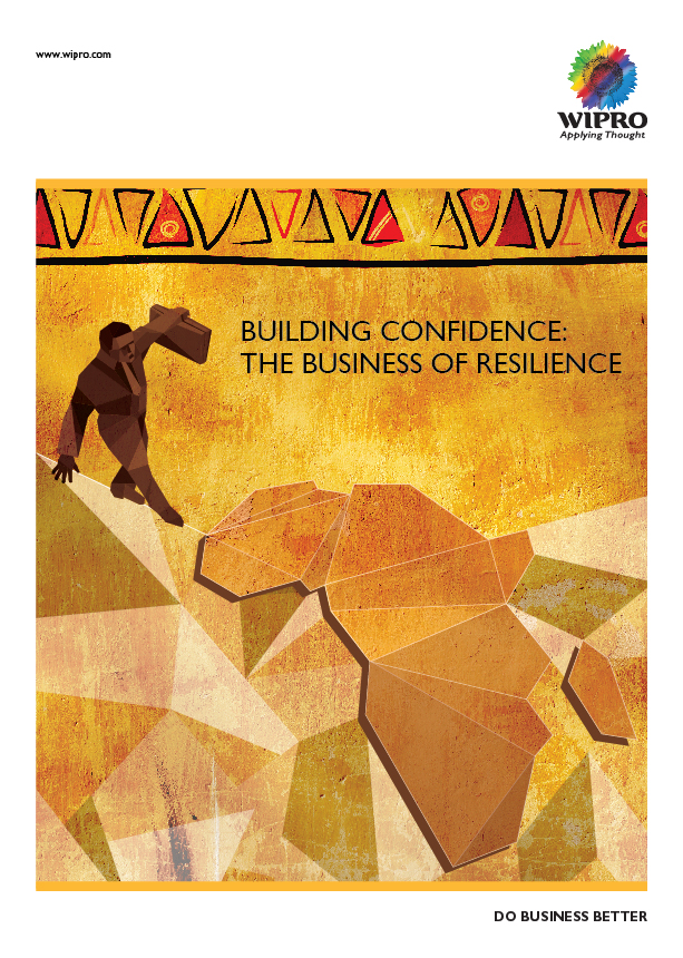
Wipro — Brochure Cover
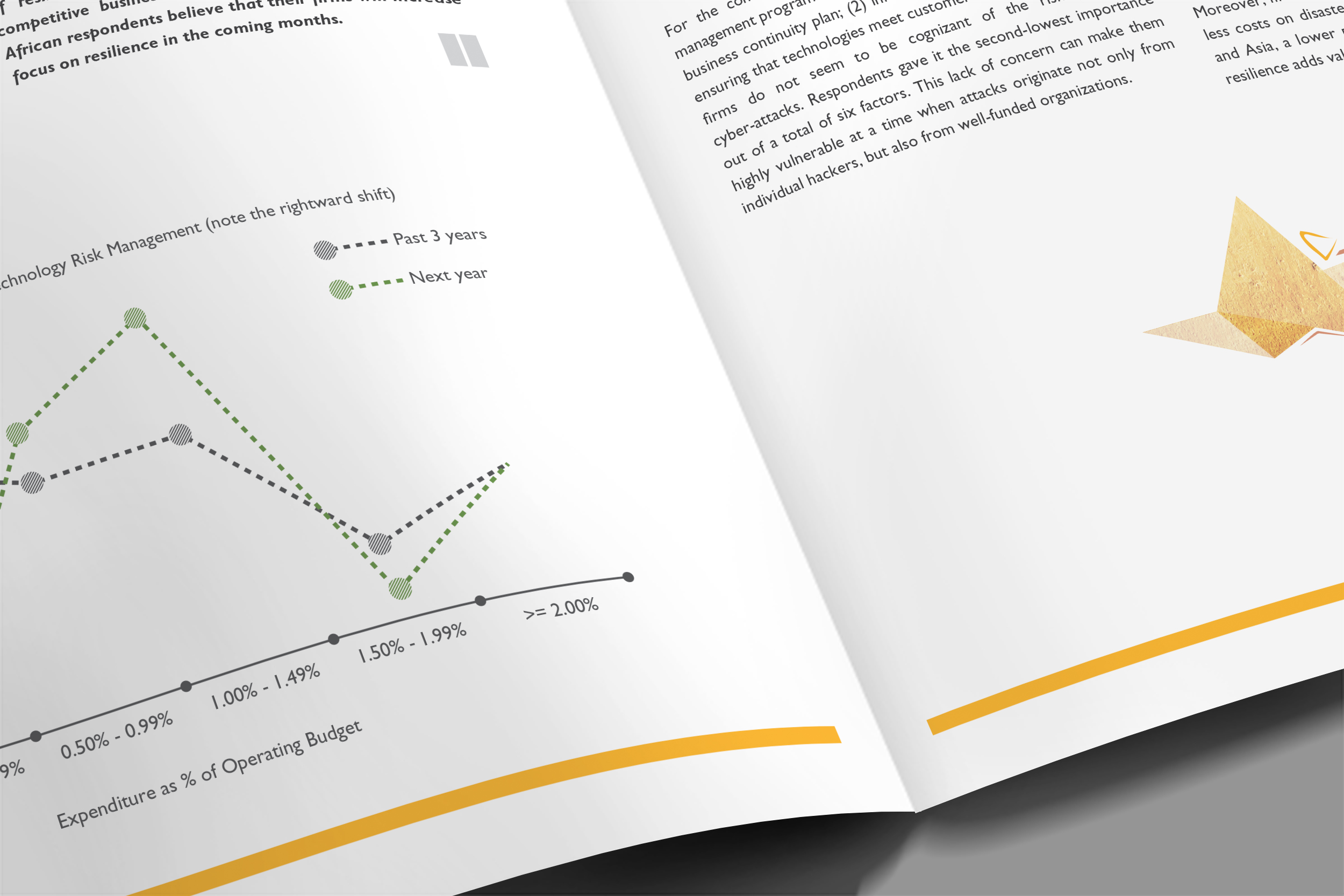
Wipro — Interior Spread: Technology Risk Management
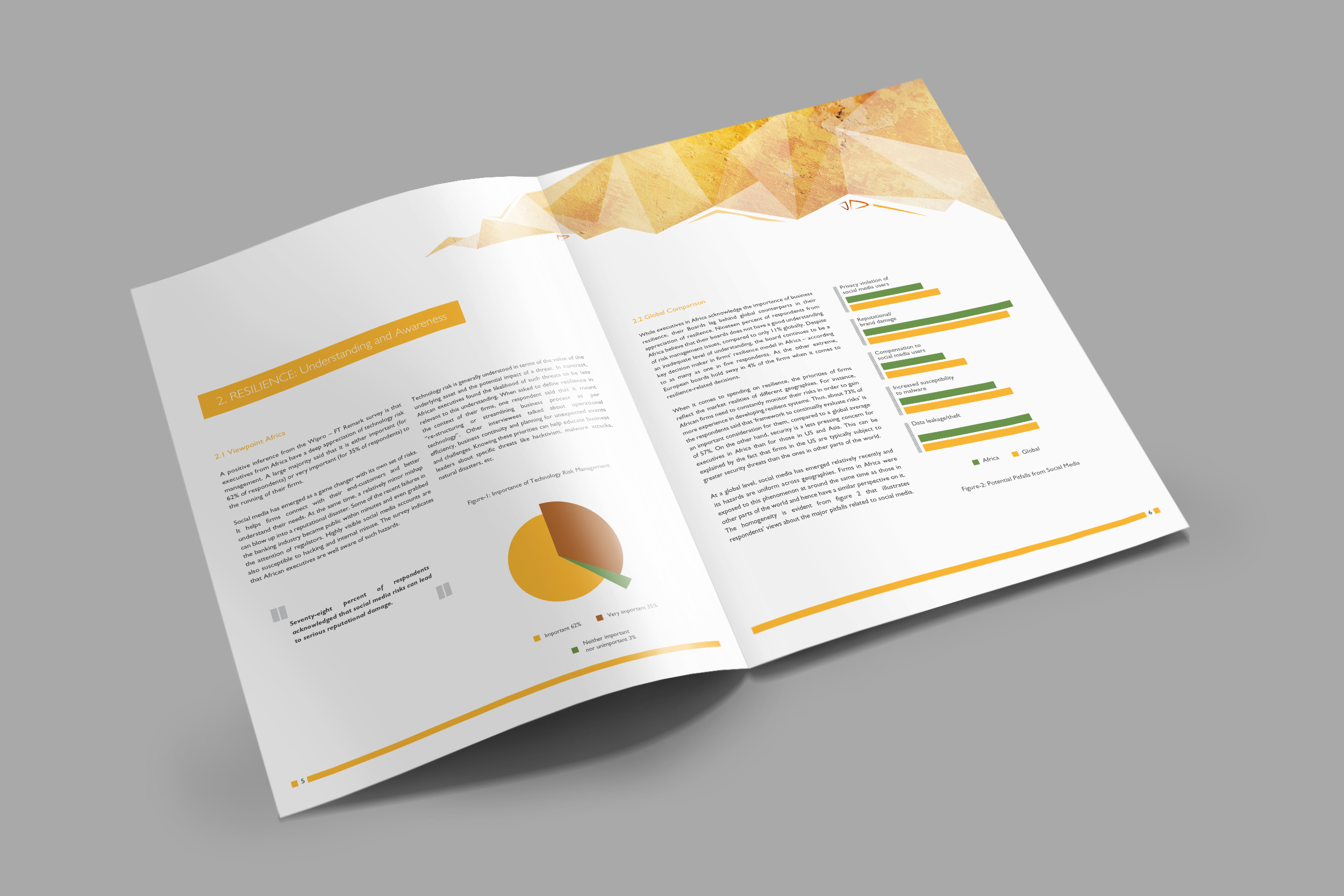
Wipro — Interior Spread: Resilience & Awareness
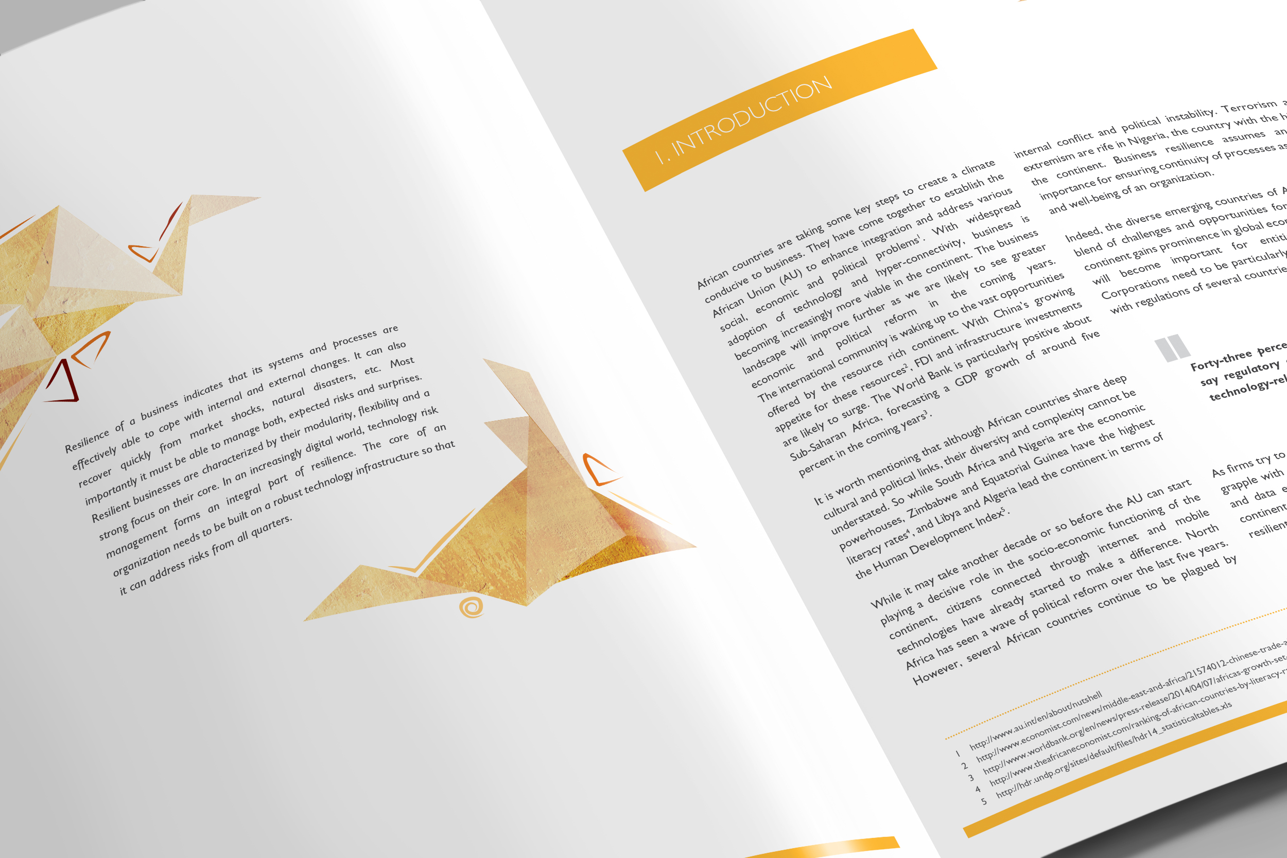
Wipro — Interior Spread: Introduction
02 — The Work

Infographics that read before they're read.

Research reports live or die by their charts. The data here — risk management expenditures, social media hazard rankings, regional resilience benchmarks — had to be scannable at a glance and precise on closer reading. Colour separates. Space clarifies. Hierarchy guides the eye before the mind catches up.

The Brief
Design a board-level research brochure on business resilience across African markets — data-heavy, brand-strict, and built for decision-makers. Nothing decorative that isn't earning its place on the page.
The Approach
White space as a design decision, not a default. Every margin, column, and gutter was measured to give the content room to speak. The Wipro palette — green, amber, white — was used sparingly and with intent: one accent per page, never competing.
Infographics
Pie charts, stacked bar comparisons, and expenditure trend lines — all built to communicate at a glance. Data visualisations designed for the C-suite: undecorated, clear in hierarchy, and colour-coded only where it genuinely aids comprehension.
Illustration
The cover says it in one image: a man walks a tightrope holding a briefcase, the rope anchored to a low-poly map of Africa — business resilience made literal. Interior spreads carry origami-like geometric forms that give the report a regional identity without stepping outside the corporate frame.
03 — Creative Approach
Layout
A strict grid system held every spread — headers, body copy, charts, and pull quotes each in their zone. Discipline as craft. The result reads as effortless because the structure never slips.
Infographics
Data visualisations designed to be skimmed before they're studied. Colour only where it separates — not where it decorates. Every chart delivers its headline before the axis labels are read.
Brand Adherence
Wipro's identity system is precise. Working within it means making the right call at every decision point — nothing arbitrary, nothing decorative — so the brand holds from cover to the final footnote.